At the beginning of the semester, our teacher kicked off our creativity skills off by asking us to take photographs of objects around our university that will best reflect any shape of the alphabet. Here are some examples...
After taking photographs for each letter, The images were assembled in alphabetical order in a PowerPoint presentation, however, this was the end of the activity.
To further expand on ideas, my very own font is to be created that is inspired by these images.
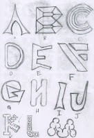
These are some early ideas...
I liked the 'K' on the second image as the straight lines were produced shorter in small sections of the text which makes it look a lot like a door key.
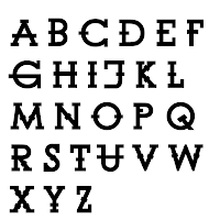
I decided to draw up a version for all letters with a black fill as default if it ever made it as a computer font type.


I would normally scan my final drawing into Photoshop or Illustrator and trace around it with the pen tool. But because this is a font, I wanted slightly more accuracy and consistency with each letter. So instead, i chose to use and existing font (Century Gothic) and manipulate the font to make it look like the one I had created. Here is the end result.


No comments:
Post a Comment