Thursday, June 17, 2010

OH&S Report


Our class as part of investigating health and safety in our workplace was required to put together a report stating anythings we found a health and safety hazard.


I downloaded a template from the Swinburne website which helped put into perspective how complicated safety can be.


Monday, June 14, 2010

A-Z Letters Podcast

Using the A-Z images, I set about creating a short podcast of the entire sequence of images. Due to problems with Garage Band, I had to import the music into itunes, saving it as an album. From there the music was imported into imovie along with the images.


Thanks to James and Tom for showing me how to import the music into imovie.

iPad eReader Cover Design

This project involves designing a front online magazine cover for an iPad application, in which the design and topic is to be an area of our interest.

Being a keen bike rider, I decided to create something bike related but with a more urban and modern twist. Having created an existing model of a dirt jump bike for a previous project in 3D class, I thought I may as well use one of the renders produced in LightWave 3D as part of my main background. Here are some initial ideas…

Here are some of the background images rendered in LightWave.

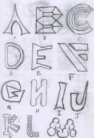
After choosing a background, I focused on using a font that best reflects the urban style. I created two pages of font layouts and found that the ‘Brooklyn Kid’ style and ‘Writers’ fonts attracted me for their level of creativity.

Moving on to devloping the design as a whole, I came to the conclusion that it would be easier if I decided on colour choice whilst in Photoshop, The title needed to appeal to dirt jump bike riders and urban doods alike, DJ Street became the covers title but upon first impressions, may cause confusion with the name of a music ‘DJ’. To work around this problem, I had to incorporate elements related to bikes to make it easier to understand. Here is some early development.

The orange splash and mist brush strokes behind the title and subheadings worked well in dragging the eye towards the crucial information. At this point in time, I thought the design needed more elements in the background which gave me the opportunity to experiment more with a variety of urban styled photoshop brushes.

As you can see, a number of effects have been used the most noticeable being the glowing edges filter which helped the text be more involved in the background. Arrows and starts collectively show riding under the stars. I tried the effects on two different background images rather than one to keep options open. At this stage, the left image is a better bet as it illustrates nighttime more successfully.

To fit the final design into the dimensions of the iPad, I had to use the marquee tool in photoshop and set the aspect ratio accordingly. I chose to do both 16:9 and 9:16 for more viewing flexibility.

Here are the final designs.

Diagram on Australian Copyright Law

Here is a mind map created in FreeMind showing links to the different laws regarding copyright in the various corners of the mutlimedia industry. I started by drawing up a small diagram and then found that the Australian Copyright council website groups each category simply.

Each category listed I broke apart and also went on to find cases where copyright has been breached such (as was the case with iinet and kazaa websites).

Monday, May 10, 2010

A-Z Letter Font Design

At the beginning of the semester, our teacher kicked off our creativity skills off by asking us to take photographs of objects around our university that will best reflect any shape of the alphabet. Here are some examples...
After taking photographs for each letter, The images were assembled in alphabetical order in a PowerPoint presentation, however, this was the end of the activity.
To further expand on ideas, my very own font is to be created that is inspired by these images.
These are some early ideas...

I liked the 'K' on the second image as the straight lines were produced shorter in small sections of the text which makes it look a lot like a door key.
I decided to draw up a version for all letters with a black fill as default if it ever made it as a computer font type.

I would normally scan my final drawing into Photoshop or Illustrator and trace around it with the pen tool. But because this is a font, I wanted slightly more accuracy and consistency with each letter. So instead, i chose to use and existing font (Century Gothic) and manipulate the font to make it look like the one I had created. Here is the end result.


Monday, May 3, 2010

Flag Design

This task required me to design my own flag that will best reflect me as a person. I had to somehow show my interests in mountain biking, art and faith into one complete design.


To begin with, I simply drew up a couple of rough thumbnail sized sketches just to generated and put down my immediate ideas. Early development revealed that a bicycle symbol is probably not going to have much impact on the audience. It also became clear that a Christianity symbols and mountains worked well together as they provided a distinct focal point.


I then moved on to experimenting with a single mock up in Photoshop and Illustrator which helped in determine appropriate colour choice and shape as well as contrast and placement.
After concluding that all these colour variations would work well together, I realised that a flag is also meant to provide a sense of stability through either symmetry or diagonal lines (e.g. England's Union Jack).

As a result, I drew up one final design that would best reflect this which became the backbone of my final design.


The solution I came up with has a variety of bright, heavy colours but like most flags, aims at demonstrating a feeling of stability with the red and white stripe running from corner to corner.
The book is meant to symbolise my interest in both learning new ideas and putting them down on paper. I chose to discard a smooth, flowing line for a straight variant with a white stroke as this will provide the security and stability image I am after. The staged green lines show the natural, mountainous landscape and the blue is calm and positive. The red works two fold providing the main focus of the image as well as illustrating downhill mountain bike trails.
To create this, first I scanned the previous sketch into Illustrator and then used a combination of line, pen and live paint bucket tools to achieve the end result.


Thanks Werner on the idea of stability in a flag

Monday, April 19, 2010

Business Card Design

Like the Flag Activity, a design was to be put together that contains things that best reflect my interests. This time around, I only drew one sketch to reduce design time.


I gathered three images from the internet and manipulated them using Photoshop to achieve a contrast in both texture and colour. The fonts, downloaded from the internet, stood out for their ease of readability and modern appearance. I used my two favourite colours, black and red with a linear gradient to distinguish figure from ground but also so the letterform would be seen more clearly.
I had difficulty in finding a rock face that provided enough depth without taking the focus away from the text. I also had trouble with choosing the right font as a lot of the modern types were not bold enough and if they were, were too plain and conservative.


Sources

  • Yeti 303 - http://www.bike-trend.com/wp-content/uploads/2009/07/yeti-303-dh-2009-1.jpg

  • Mountains - http://www.desktoprating.com/wallpapers/landscape-wallpapers-pictures/amazing-green-mountains-with-trees-lanscape-wallpaper.jpg

  • Rocks - http://upload.wikimedia.org/wikipedia/commons/5/5d/Glyder_Fawr_rocks.JPG

  • Ben Pioneer Font - http://www.cooltext.com