Monday, May 10, 2010

A-Z Letter Font Design

At the beginning of the semester, our teacher kicked off our creativity skills off by asking us to take photographs of objects around our university that will best reflect any shape of the alphabet. Here are some examples...
After taking photographs for each letter, The images were assembled in alphabetical order in a PowerPoint presentation, however, this was the end of the activity.
To further expand on ideas, my very own font is to be created that is inspired by these images.
These are some early ideas...

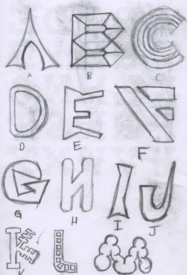
I liked the 'K' on the second image as the straight lines were produced shorter in small sections of the text which makes it look a lot like a door key.
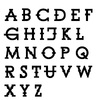
I decided to draw up a version for all letters with a black fill as default if it ever made it as a computer font type.

I would normally scan my final drawing into Photoshop or Illustrator and trace around it with the pen tool. But because this is a font, I wanted slightly more accuracy and consistency with each letter. So instead, i chose to use and existing font (Century Gothic) and manipulate the font to make it look like the one I had created. Here is the end result.


Monday, May 3, 2010

Flag Design

This task required me to design my own flag that will best reflect me as a person. I had to somehow show my interests in mountain biking, art and faith into one complete design.


To begin with, I simply drew up a couple of rough thumbnail sized sketches just to generated and put down my immediate ideas. Early development revealed that a bicycle symbol is probably not going to have much impact on the audience. It also became clear that a Christianity symbols and mountains worked well together as they provided a distinct focal point.


I then moved on to experimenting with a single mock up in Photoshop and Illustrator which helped in determine appropriate colour choice and shape as well as contrast and placement.
After concluding that all these colour variations would work well together, I realised that a flag is also meant to provide a sense of stability through either symmetry or diagonal lines (e.g. England's Union Jack).

As a result, I drew up one final design that would best reflect this which became the backbone of my final design.


The solution I came up with has a variety of bright, heavy colours but like most flags, aims at demonstrating a feeling of stability with the red and white stripe running from corner to corner.
The book is meant to symbolise my interest in both learning new ideas and putting them down on paper. I chose to discard a smooth, flowing line for a straight variant with a white stroke as this will provide the security and stability image I am after. The staged green lines show the natural, mountainous landscape and the blue is calm and positive. The red works two fold providing the main focus of the image as well as illustrating downhill mountain bike trails.
To create this, first I scanned the previous sketch into Illustrator and then used a combination of line, pen and live paint bucket tools to achieve the end result.


Thanks Werner on the idea of stability in a flag