


To begin with, I simply drew up a couple of rough thumbnail sized sketches just to generated and put down my immediate ideas. Early development revealed that a bicycle symbol is probably not going to have much impact on the audience. It also became clear that a Christianity symbols and mountains worked well together as they provided a distinct focal point.


I then moved on to experimenting with a single mock up in Photoshop and Illustrator which helped in determine appropriate colour choice and shape as well as contrast and placement.
After concluding that all these colour variations would work well together, I realised that a flag is also meant to provide a sense of stability through either symmetry or diagonal lines (e.g. England's Union Jack).
As a result, I drew up one final design that would best reflect this which became the backbone of my final design.

The solution I came up with has a variety of bright, heavy colours but like most flags, aims at demonstrating a feeling of stability with the red and white stripe running from corner to corner.
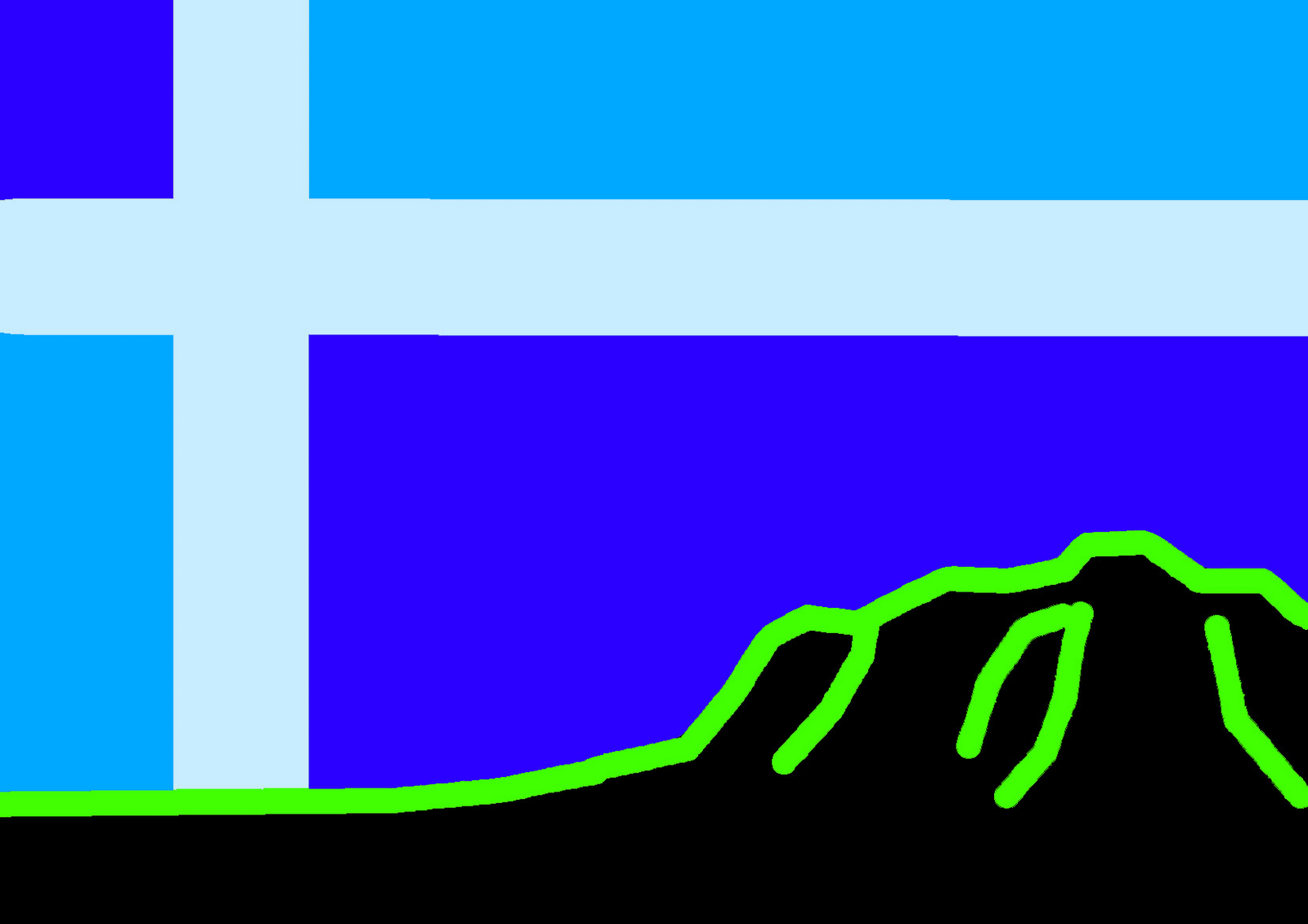
The book is meant to symbolise my interest in both learning new ideas and putting them down on paper. I chose to discard a smooth, flowing line for a straight variant with a white stroke as this will provide the security and stability image I am after. The staged green lines show the natural, mountainous landscape and the blue is calm and positive. The red works two fold providing the main focus of the image as well as illustrating downhill mountain bike trails.
To create this, first I scanned the previous sketch into Illustrator and then used a combination of line, pen and live paint bucket tools to achieve the end result.

Thanks Werner on the idea of stability in a flag
No comments:
Post a Comment